Visualizing the Year in Headlines with MICA Design Grads
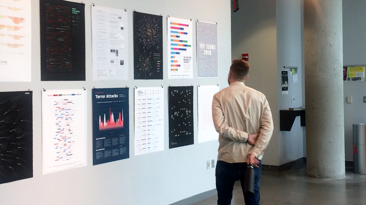
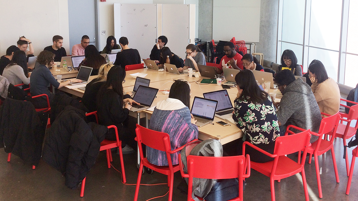
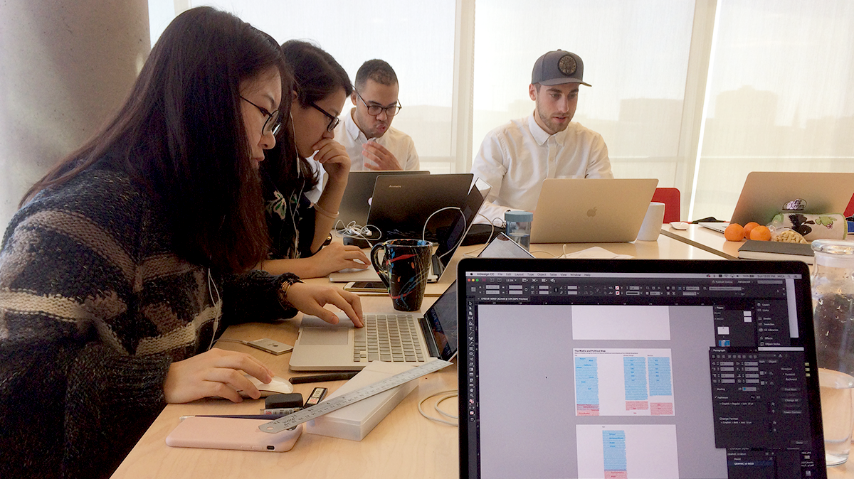
Eric and I returned to the Maryland Institute College of Art last month to lead a weekend workshop with the Graphic Design MFA program. We challenged the students to expand their definition of data visualization by using text as a data source in their design work. The students powered through a fast-paced design process to create an amazing series of posters that visualize news headlines from the past year.
We wanted to give the students the opportunity to work with news headlines because they are an essential window into what’s happening in the world. With the American news media under fire in the current political climate, it seemed timely to take a critical look at the power of these short phrases.
Finding data sources in unusual places
We were excited to introduce the students to our methods for using data to drive design. Viewing the world through a lens of data is inherent to the way we design at Soso. We take an expansive view of data, finding troves of information in often overlooked places, like live TV broadcasts, social media rhetoric, body movement, and static imagery.
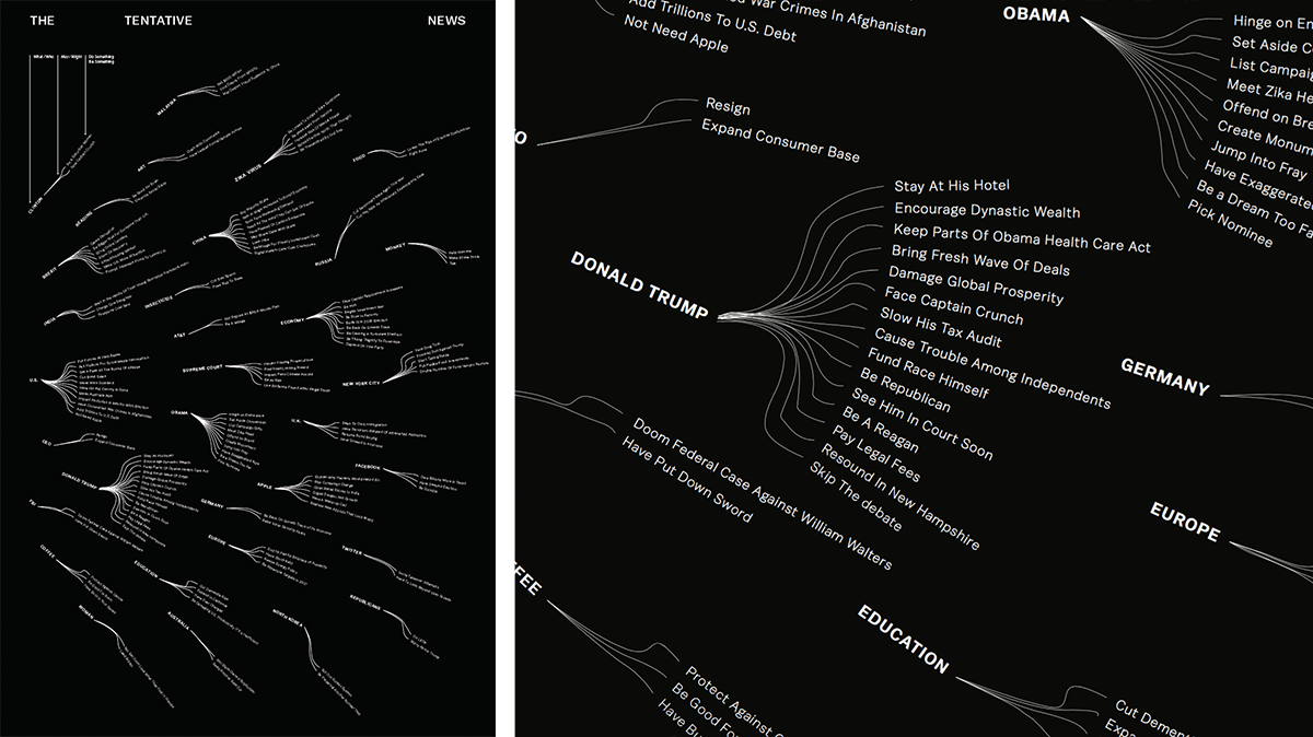
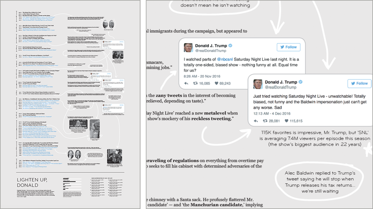
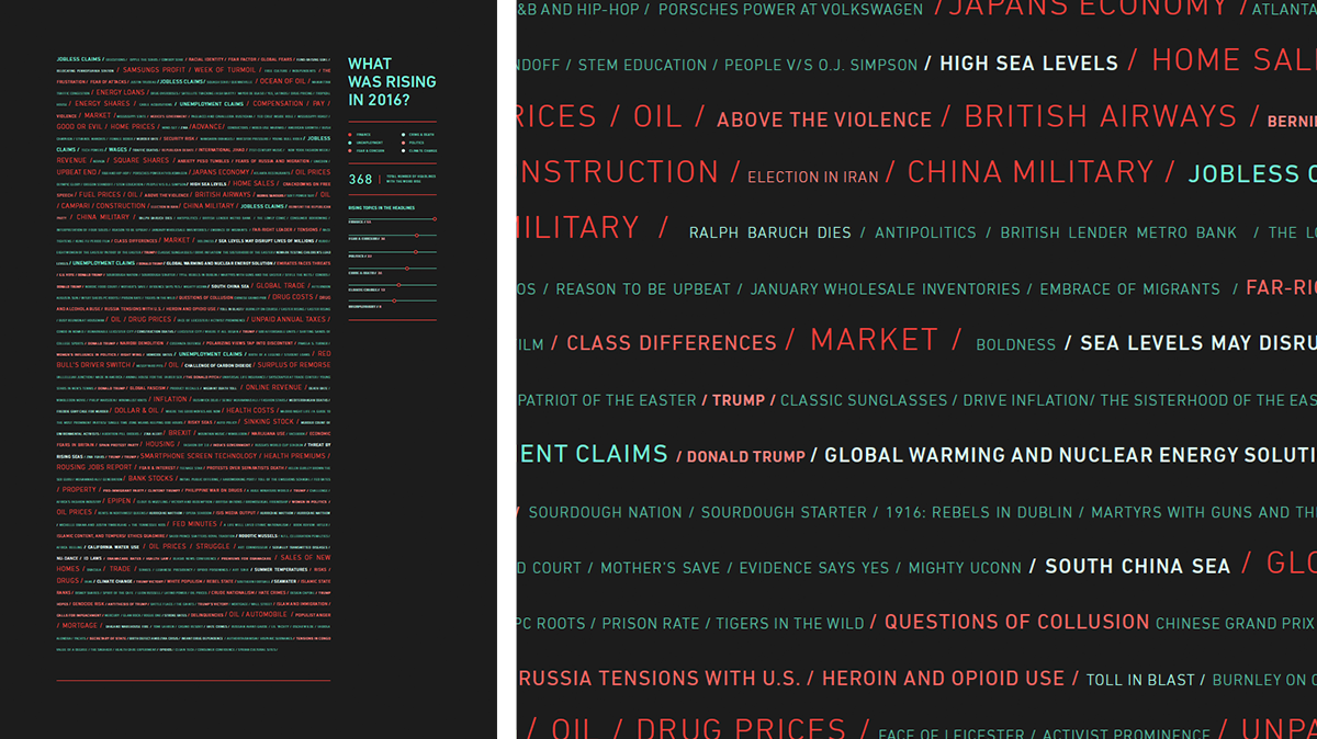
Text is a particularly rich and layered data source: you can count word frequency and turn it into quantitative data, analyze the grammar and syntax of the language, interpret the meaning of the content, and examine the broader context of authorship and history. Headlines in particular are compact, carefully crafted, and meant to summarize an entire article that may or may not be read.
Unearthing surprising stories in the headlines
The students approached the project by first looking for patterns and insights in the archived headlines. We created a web-based tool for exploring the news headlines as quantitative data. We made a similar tool for last year’s workshop that looked at State of the Union Addresses.
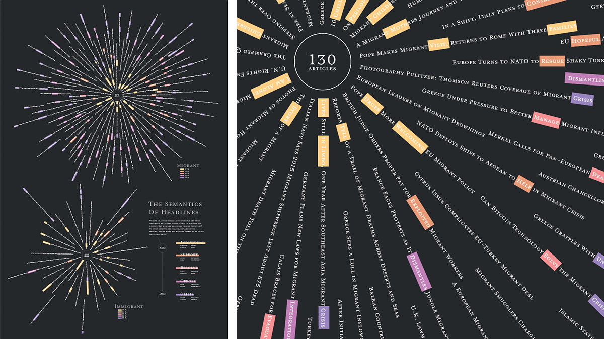 This revamped version explores the 2016 headlines from the Wall Street Journal and the New York Times. It includes more robust search syntax, language and sentiment analysis using LIWC dictionaries, top trending words per week, and links back to the source articles. We'll be posting the 2016 Headlines Explorer as a public resource in the near future.
One data set, many stories
The students found an impressive variety of interesting subjects and stories to capture with their visualizations. Some dealt with the entire year’s worth of headlines, while others narrowed down to specific time periods. Once they found something intriguing, they experimented with sketching different concepts for how they could visualize that particular story. We encouraged them to edit out extraneous information and to make design decisions in service of communicating the core idea.
We were delighted to see the variety of topics adressed in the posters and a range of creative visual approaches to treating text as data. It was a lot to ask in two days, but the students knuckled down and made some beautiful and thought-provoking work. It’s always a treat to be back at MICA. Thanks to Ellen, Jason, and the class of 2018 for having us!