2016 Headlines Explorer
Let’s be honest, most of us get most of our news from the headlines. There’s not enough time in a day to read all the articles. And even when we make it all the way through an article, we can’t unread the headline. It has worked its subtle magic, coloring all of the words that followed it.
2016 was a big year for headlines in America. At least it felt that way on the ground. We thought it would be nice to take a big step back and see what kinds of patterns emerged looking at an entire year’s worth of headlines.
Text as Data
When we deconstruct, categorize, and count text, when we view it as data, we can step back and experience the written word through new lenses. This lets us answer questions like:
How do headlines reflect world events? How do they speak about certain types of stories compared to other ones? Is there a bias in the way newspapers report the news? What words are used most often? How does the language shift over time?
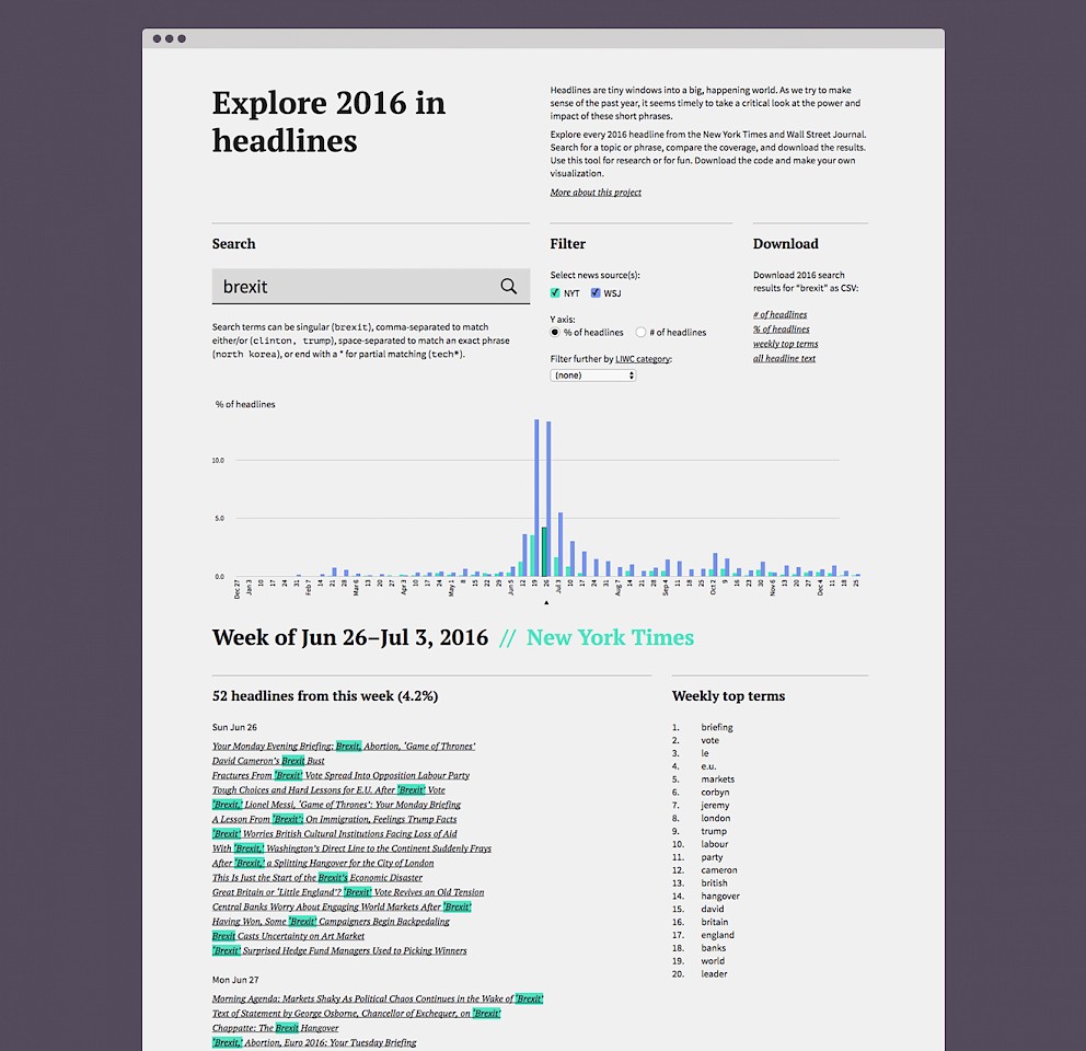
For our dataviz workshop at the Maryland Institute College of Art, we created a visualization tool that lets you explore, analyze, and visualize the headlines of 2016. You can access it online or download the code from Github.
The explorer loads all of the 2016 headlines from the New York Times and Wall Street Journal. It’s not a perfect matchup, but we wanted to include a left and right leaning paper to allow for some comparison. The content is sourced from the New York Times API and the Wall Street Journal Archives.
How to Use It
The hardest part of using it is thinking of good search terms.
1) Enter any word or phrase into the search box.
2) Optionally narrow your results to a specific category with the LIWC pulldown.
3) Click the magnifying glass.
4) Roll over the bars on the graph to select a week of news.
5) Browse the results below the graph.
The bar graph shows how many times your search term appeared in the headlines each week of the year. You can view the number of headlines in each paper, or compare them by looking at the % of headlines. The results below show all of the headlines that include your search term for the week. Weekly Top Terms are the words that appear most frequently alongside your search term.
Finding Stories in the Headlines
In the course of developing the tool and playing with it at our workshop, we discovered some interesting patterns. We share these three to highlight a few ways of approaching headlines as data.
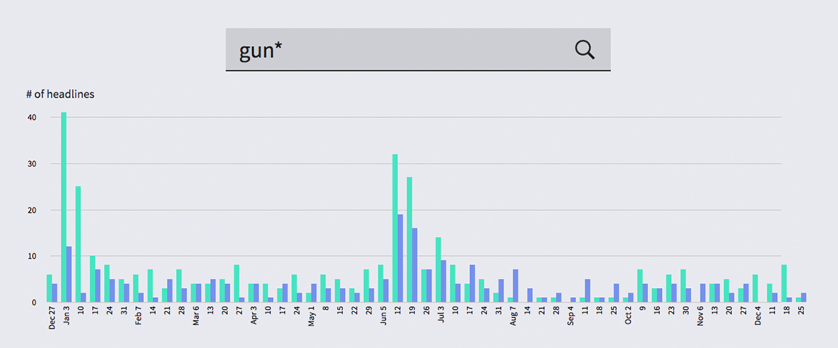
The bar graph for gun* (which catches gun, guns, gunman, gunshot, etc) tells a simple, clear story. The two spikes in the graph reveal two major events in 2016: President Obama’s push for gun control after San Bernardino and the Orlando nightclub shooting.
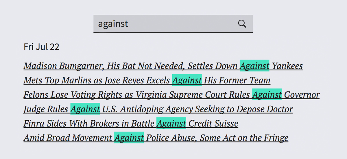
The word “against” implies opposition. By examining the way the word is used in the headlines, we get a kind of year in review on opposing people and ideas. We also get a flavor for how opposing forces are portrayed in the news.
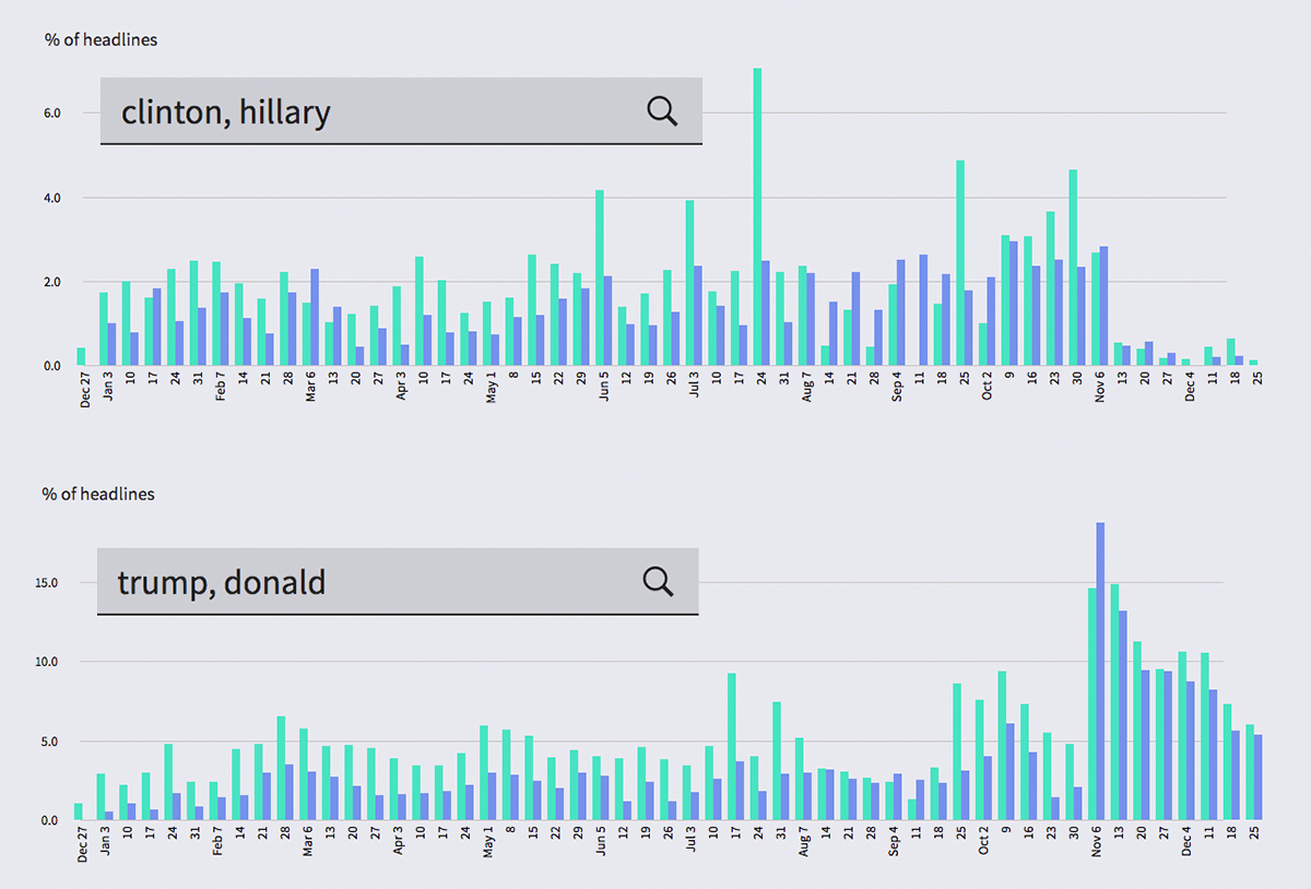
When we compared the frequency of the words “Hillary” and “Trump” in the headlines, we found a lopsided result. Even in the left-leaning New York Times, Trump’s name appeared in the headlines significantly more frequently than Hillary’s.
Use it. Share it.
The 2016 Headline Explorer is open source. Use it online. Download the code. Use it for research. Use it for fun. Use it to tell a story or to make your own visualization. We’d love to see what you do with it.