5 Insights About the Current State of Design
AIGA and Google Design’s 2016 Design Census is an initiative that aims to help the design community grasp “the complex economic, social, and cultural factors shaping the design practice today.” A survey was conducted from December 1st through the 19th that asked questions pertaining to industry, salary, demographics, and coffee consumption. When the results came in, we partnered with AIGA to create a tool that makes it easier for designers to create their own visualizations.
The Design Census Data Explorer allows users to select two questions and visualize the correlation between the responses. The results are plotted in a bubble chart, in which the size of the bubble corresponds with the number of responses. Designers can quickly pinpoint trends and download the selected data as a CSV. When interacting with the tool, the most insightful moments surface not only from the largest bubbles, but also from the ones that reveal a clear pattern or disruption in the data.
After spending some time interacting with the Data Explorer, we compiled a list of combinations that reveal something insightful about the current state of design. Take a look at our findings below.
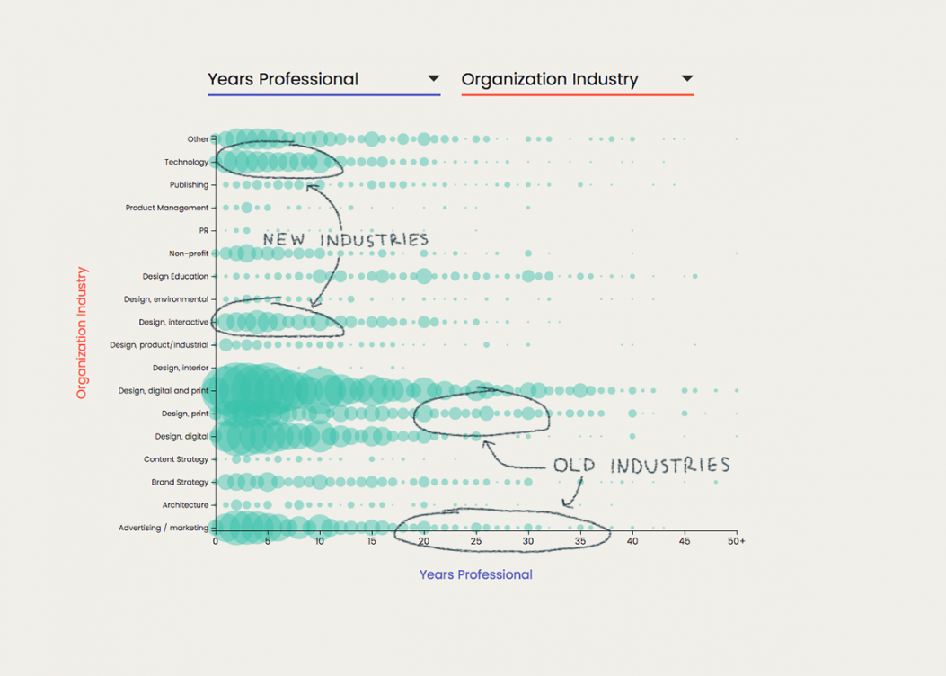
1. Design is migrating from Madison Avenue to Silicon Valley.
If you compare Years Professional with Organization Industry, you can get a sense of the past, present and future of design. The Technology and Interactive Design industries are more common with people who have less than ten years of experience, while people who have twenty or more years of experience are more likely to be in the Print and Advertising industries. These patterns reveal how job opportunities in the tech sector are continuing to grow, while older industries like print are perhaps becoming more limited or specialized.
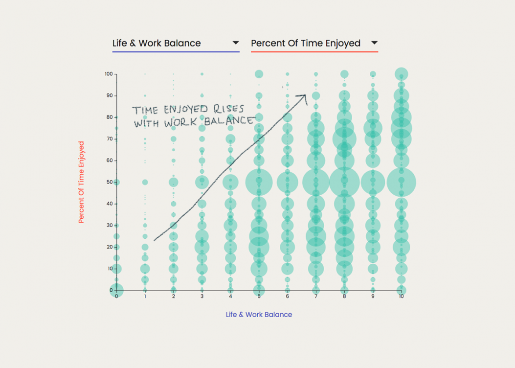
2. The key to enjoying your work? Do less of it.
You can observe a clear gradation in the chart when comparing Life & Work Balance to Percent Of Time Enjoyed. Notice how there are very few people with a Life/Work Balance rating of below 3 who responded that they enjoy more than 30% of their time. Sure, most designers love what they do, but taking a break once in awhile seems to help make that love grow!
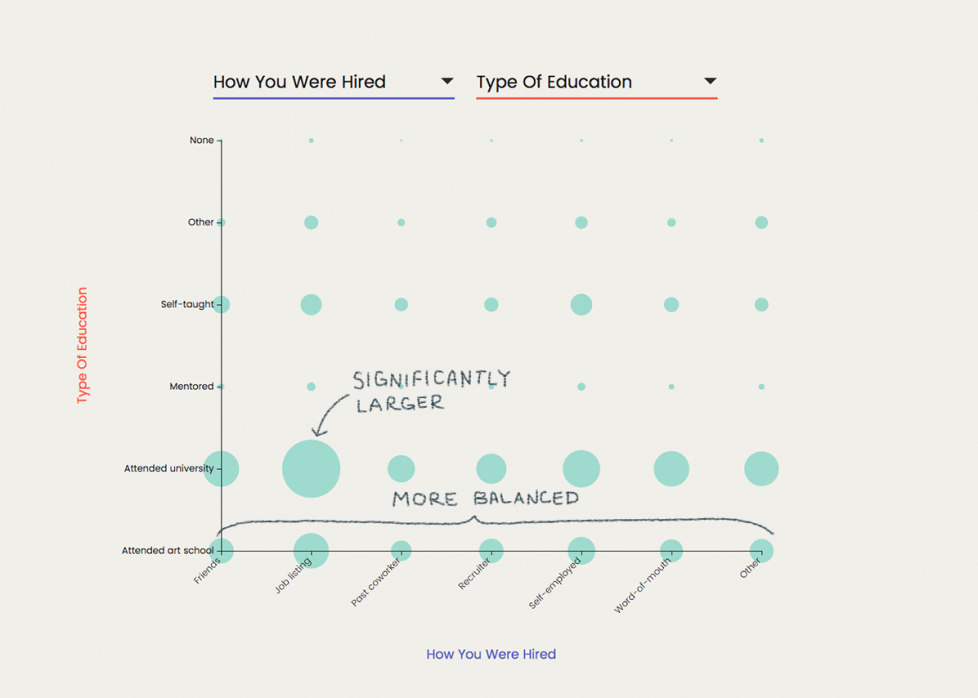
3. Consider a Bachelor of Fine Arts in Networking.
One of the reasons why a designer might attend a pricey art school is the opportunity to join a prestigious network of professionals. If you compare How You Were Hired to Type Of Education, you can see that those who have attended a university overwhelmingly tend to land their job offers through a listing. On the other hand, a higher proportion of those who attended art school were hired by friends, a past coworker, or through word-of-mouth.
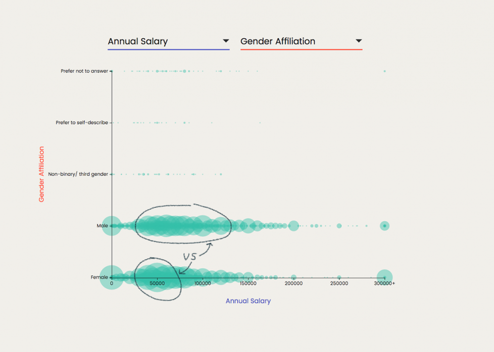
4. Mr. Eaves still gets paid more than Mrs. Eaves.
Unfortunately, even the design industry is not exempt from the gender-based pay gap. When comparing Annual Salary and Gender Affiliation, notice that the Female responses balloon around $50k, while the Male responses are consistent from $50k all the way through $150k.
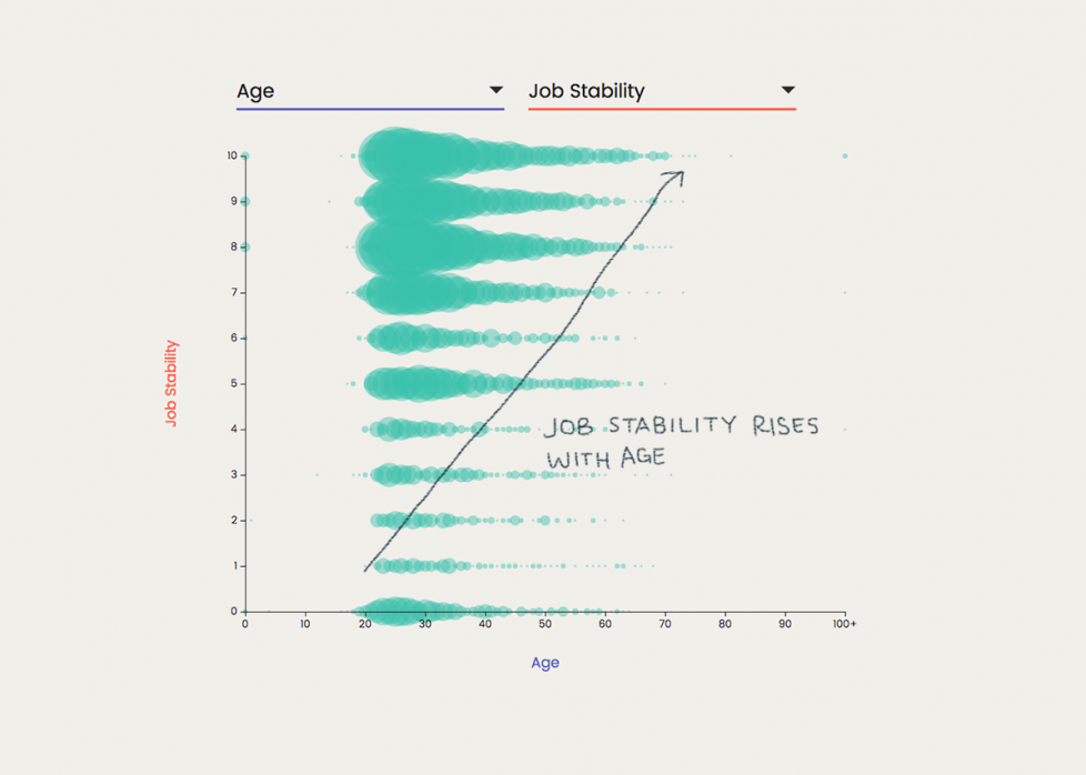
5. Job stability is like a fine wine.
Confidence in your job increases with time, as demonstrated when comparing Age with Job Stability. Most designers are feeling pretty stable across all ages, rating their job stability between 7 and 10. As ages increases (moving to the right on the chart), fewer people report feeling unstable.
These are just a few of the trends that we’ve come across while interacting with the tool. We encourage others to visit aiga.sosolimited.com and dive into the data. Reach out to us at info@sosolimited.com if you’ve discovered a compelling trend or pattern.