What's New
A behind-the-scenes look at what we’ve been working on, our thinking, process, and latest news.
April 26, 2017
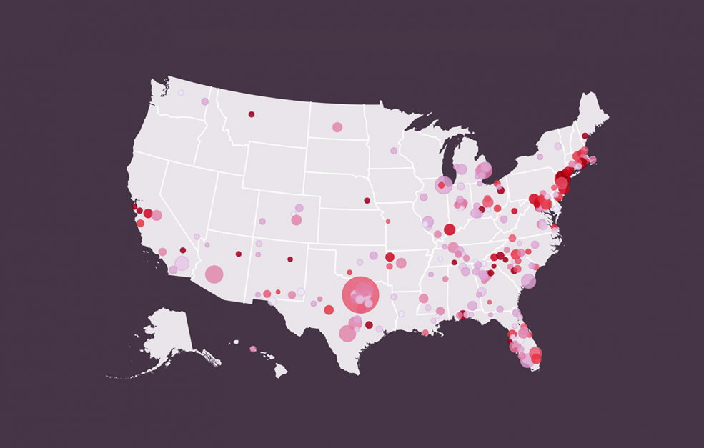
Have you ever wondered what time of year you’re most likely to get a fever? What about the region of the country that tends have more feverish people than others? Do kids really get sick more often than grown-ups? Ponder no more: we’ve teamed up with athenaInsight to create an interactive data visualization that takes on these questions.
April 13, 2017
2016 Headlines Explorer
Data Viz, Open Source, By eric
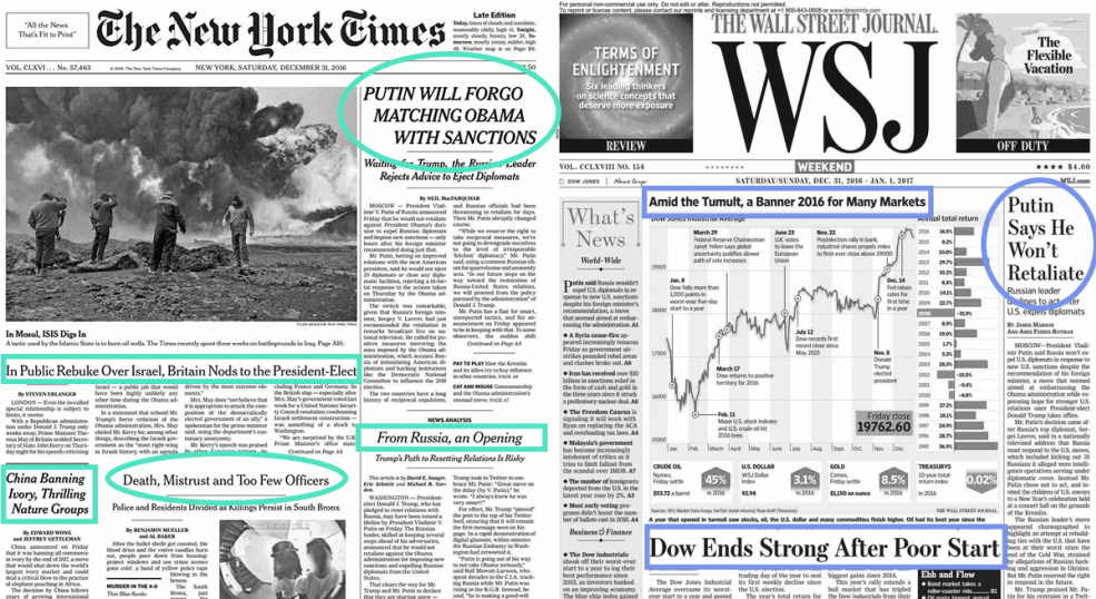
Let’s be honest, most of us get most of our news from the headlines. There’s not enough time in a day to read all the articles. And even when we make it all the way through an article, we can’t unread the headline. It has worked its subtle magic, coloring all of the words that followed it.
March 29, 2017
Connecting healthcare professionals to data-driven insights
Data Viz, Design, By Jackie & Olivia
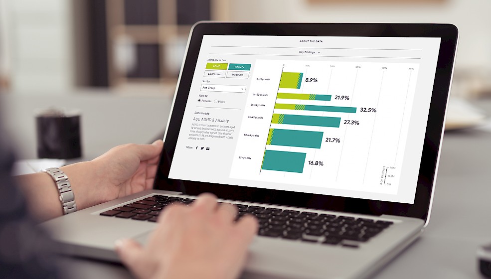
How can doctors use the information they collect every day to better understand behavioral health and take care of patients with mental illnesses? Our new interactive for athenaInsight gives healthcare professionals access to data-driven insights into American mental health.
March 3, 2017
Visualizing the Year in Headlines with MICA Design Grads
Data Viz, Talks, By Jackie & Eric
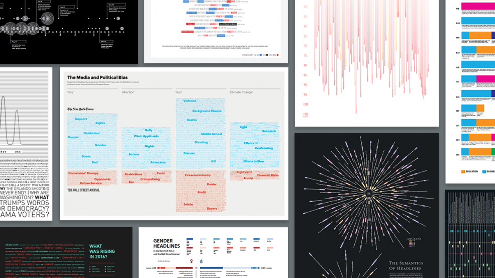
Eric and I returned to the Maryland Institute College of Art last month to lead a weekend workshop with the Graphic Design MFA program. We challenged the students to expand their definition of data visualization by using text as a data source in their design work. The students powered through a fast-paced design process to create an amazing series of posters that visualize news headlines from the past year.
February 2, 2017
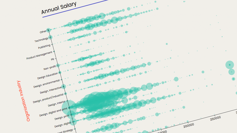
AIGA and Google Design’s 2016 Design Census is an initiative that aims to help the design community grasp “the complex economic, social, and cultural factors shaping the design practice today.” A survey was conducted from December 1st through the 19th that asked questions pertaining to industry, salary, demographics, and coffee consumption. When the results came in, we partnered with AIGA to create a tool that makes it easier for designers to create their own visualizations.
March 16, 2016
Data Viz Workshop at MICA
Design, Talks, Data Viz, By Jackie & Eric
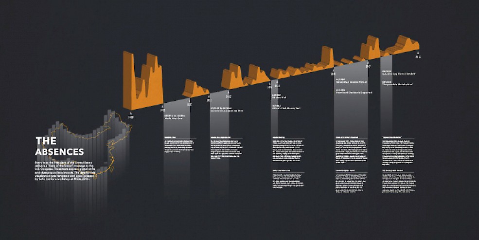
A few weeks ago, Eric and I visited the Maryland Institute College of Art to conduct a weekend workshop with the Graphic Design MFA students. The students were tasked with creating posters to visualize the transcripts of the State of the Union Addresses, from Washington to Obama. The State of the Union is a lens into a changing America and a changing world, giving insight into national priorities over past 200+ years. With the upcoming presidential elections, we thought this was a timely topic and an opportunity to get thinking about the role of a designer in shaping political conversation.