Our New Interactive Map for athenaInsight
Have you ever wondered what time of year you’re most likely to get a fever? What about the region of the country that tends have more feverish people than others? Do kids really get sick more often than grown-ups? Ponder no more: we’ve teamed up with athenaInsight to create an interactive data visualization that takes on these questions.
The fever tracker is our second interactive data visualization created for athenaInsight. It allows users to see fever rates across the nation week-by-week. Here are a few data points that we’ve learned through interacting with the visualization:
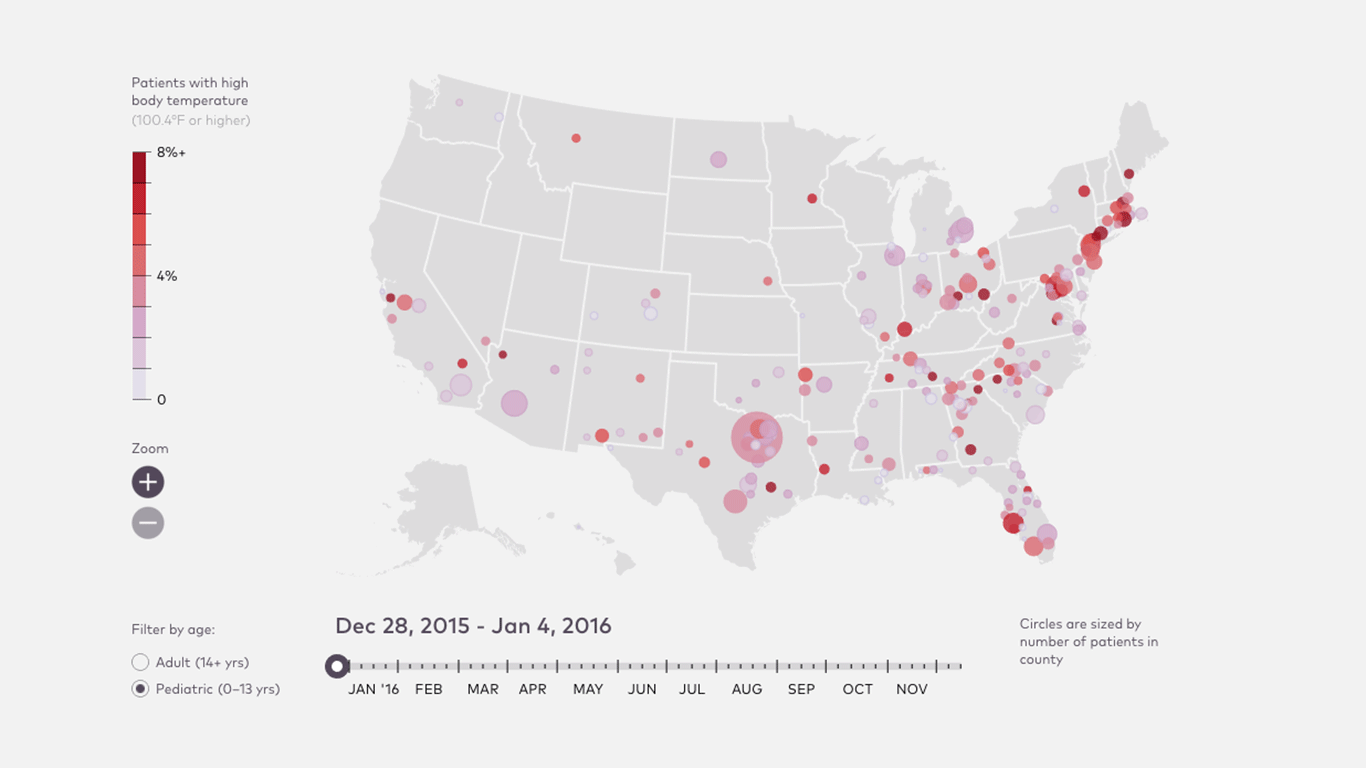
1. Children almost always measure higher temperatures than adults.
As we age, our bodies become cooler, so it's no surprise that Pediatric patients almost always measure higher temperatures than Adult.
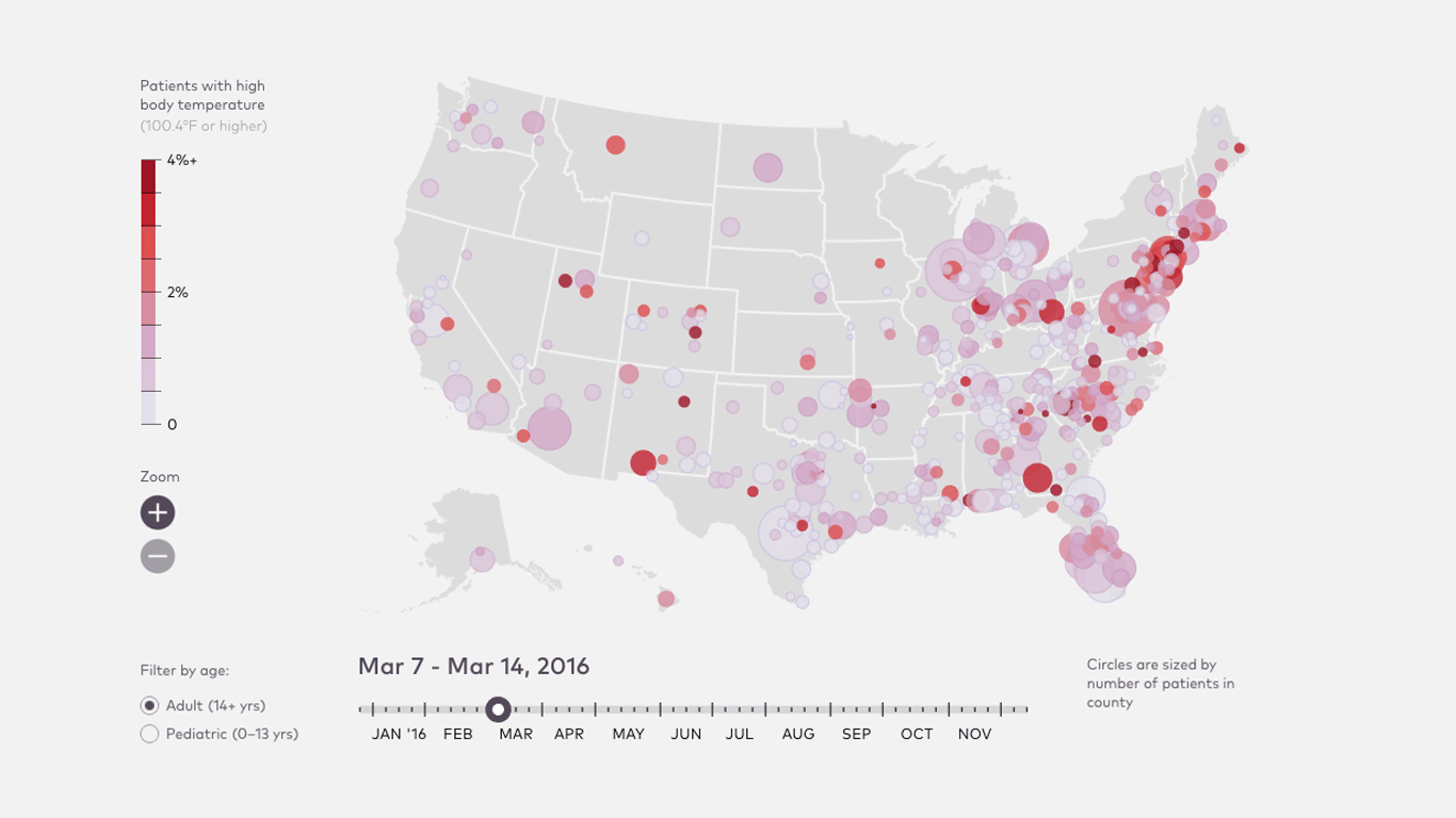
2. In 2016, fevers occured most during the second week of March.
Across the country, the fever rate for both Pediatric and Adult patients was highest in early March.
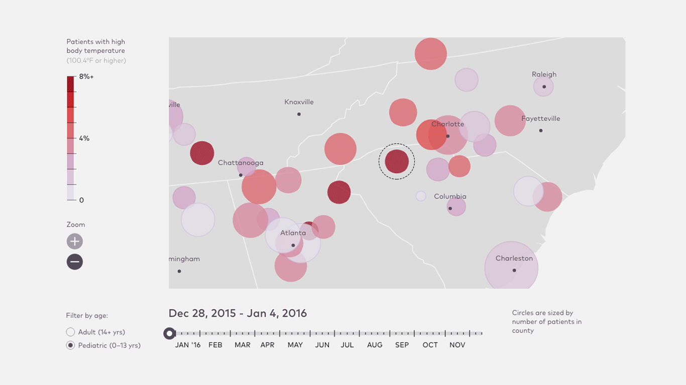
3. Spartanburg, SC can’t beat the heat.
In this South Carolina county, an average of 10.2% of Pediatric patients measured had fevers in 2016.
Visit athenaInsight to interact with the visualization yourself. And keep checking in, because the data will be updated regularly!